Posted 2018 December 01
In my work supporting Mac labs for visual and performing artists, one of the things I had to learn about fairly early on was colour: gamut, colour spaces, additive vs. subtractive, ColorSync, calibration, ICC profiles, display technologies, and so on. As hardware has become generally more capable and new standards have emerged, I’ve had to dive even deeper into the topic. This post is about sharing my most recent learnings about “Deep Colour” support on macOS hardware and software, since I have not found another source that documents this. But first, a little context.
Disambiguation
For those of you who follow me on Twitter, you’ll know that I have struggled with how to properly discuss this topic. It’s very multidimensional, so it’s hard to talk about one dimension without touching on the others. This screenshot from the Apple web site, detailing the technical specs of the two stock 21.5" iMac models, is probably the most succinct way to illustrate the factors at play:
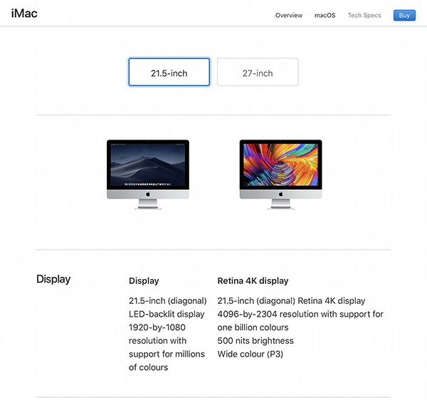
The web site lists six features of the iMac Retina 4K display:
- Physical size (21.5 inches diagonally)
- Resolution (4096 × 2304 pixels)
- Pixel Density (“Retina” display)
- Colour depth (One billion colours)
- Brightness (500 nits or 500 cd/m2)
- Colour width (Display P3 colour space support)
When compared to the non-Retina version, there are two main differences in how colour is reproduced: the non-Retina version only supports “millions” of colours and it does not support “Wide colour.”[1] In their keynote presentations, Apple has chosen to focus on the addition of Wide colour via the P3 colour space, likely because that resonates with their Creative clients. The P3 colour space allows professionals working with video and photographs to expand the range of colours they can see onscreen by about 25% as compared to traditional (or cheaper) displays that only support the sRGB colour space. While you have been able to purchase displays with larger colour gamut for some time (we refer to these at my place of work as “Art-grade displays”), these displays have gotten much better over the past few years, and Apple’s support in the iMac line (and in its iOS devices) has brought those benefits to the masses. Apple has chosen the P3 colour space, which matches the colour space used in cinemas,[2] but they just as easily could have chosen Adobe RGB (1998), which is another common space favoured by photographers. Adobe RGB covers the same volume of space as P3 but can reproduce a few more greens and green-blue colours whereas P3 favours some red, magenta, orange, and yellow colours. There are a lot of great resources to help you understand Wide colour better than I could ever explain, but I’m going to suggest these three Apple-centric resources as a starting point if you wish to explore this topic further:
- WWDC 2016 Session: Working with Wide Color — the first 10 minutes with Justin Stoyles is a really good overview;
- Improving Color on the Web – a WebKit blog post by Dean Jackson that gives some great visual examples you can test on your own hardware;
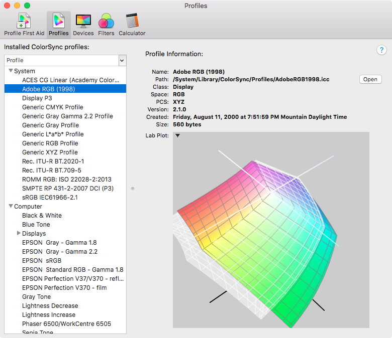
- ColorSync Utility — yes, the app in the Utilities folder on your Mac, in which you can explore different colour spaces and even compare them, all while being able to manipulate a 3D representation of the space. (See the screenshot below, comparing Adobe RGB [in colour] versus P3 [in white].)
Apple has supported Wide colour in Retina iMacs since the Late 2014 model, in iPhones since the iPhone 7, and in all iPad Pro models except the original 12.9" model.
Deep Colour
Once you’ve decided which colour space you are operating in, you need to digitally represent the colours within that space. If you’ve worked with web sites or even with Photoshop, you’ll be aware that it is common to describe a colour using values of 0–255 for each of Red, Green, and Blue. That is 8-bit colour, as each of your primaries is being described in terms of an 8-bit number. Confusingly, this is also called 24-bit colour in some instances, because it is 8 bits times 3 channels.[3]
When we start dealing with wider colour spaces, if we still only use 8 bits to describe each colour channel, we’re not increasing the number of colours we can see, just changing which ones they are. If you’re old enough to remember back to the early days of the web, you’ll remember that people used GIFs for (static) images on web sites but those images were often posterized, as they were limited to a palette of 256 colours (not 256 per colour channel—256 total). Essentially, this is the same problem 20 years later. If we don’t increase the number of bits we use to describe that broader range of colours, we encounter situations where colour transitions can have “banding” problems (e.g., gradients don’t appear smooth). To counter this, apps like Photoshop allow you to create and edit documents in 16-bit or 32-bit (per channel) colour. Such modes, paired with an appropriate colour space (e.g., ProPhoto RGB), allow you to increase the accuracy of the colour data inside the file and improve what is displayed on capable output devices (this applies to printers as well as displays).
When Are We Getting 16-bit Displays?
No, we’re not getting 16-bit displays any time soon. But we do have 10-bit displays[4] (from companies such as Eizo, NEC, LG, and even Dell) and 12-bit displays are on the horizon. So when Apple says the display in their Retina iMac supports a billion colours, they mean 10-bit colour: 210 per channel = 1.07 billion colours. Once again, just to add to the confusion, you will also see this referred to as 30-bit colour (10+10+10).
Your display will take 16-bit information from the computer and convert it on the fly to show as wide a range as it can. Some displays, like the NEC PA series, have internal lookup tables (LUT) of more than 10 bits to try to improve the the colour accuracy even further when converting from the original file. Regardless, if you are feeding your display 8 bits of information per colour channel, it doesn't matter how good your display is, the banding issues will not go away.
Seven Six Steps to Heaven
So know we know there are 10-bit displays out there if we need them for our colour-sensitive work—and soon enough, for all of our movie-watching and online video-binging needs. But there are five additional factors that limit whether you can see those Deep colours. First is the OS. Apple didn’t support Deep colour in macOS until 10.11.2. I have external displays in my Labs purchased before El Capitan came out that can now show the 10-bit colour abilities that they have always had.
Second is the graphics processor on your device. In a Technical White Paper on the topic, Intel says that their integrated graphics chips have supported Deep colour since the Sandy Bridge generation of processors. Dedicated GPUs usually support Deep colour as well, including the ones shipped with the last-day-of-2013 Mac Pro model. Surprisingly, this has not led to support on all of Apple’s Macs, at least on internal displays.
This makes me surmise that there is a third factor: the underlying computer hardware and firmware. My 2014 Mac mini computers that are running macOS 10.13.6 and have a 10-bit display attached claim that they are only able to show 8-bit colour. The Intel graphics chip inside is, according to Intel, able to support 10-bit, albeit not in all resolutions or connections. And yet, it doesn’t.
I just alluded to the fourth additional factor: the connection between the computer and the display. In the Intel document I cited earlier, they mention that there are some “bandwidth restrictions” that limit the resolution and/or refresh rate at which 10-bit colour is supported based on how the display is connected (TL;DR DisplayPort connections may give you more options than HDMI). So it’s probably time to stop using DVI connectors if you want 10-bit colour on your external displays. Now it may be that these last two restrictions are one and the same, but I have neither the technical knowledge nor the variety of hardware to test that theory.
The final factor is a big one: the software you are using. The app has to be coded to leverage what the OS and hardware are providing, otherwise you will only get 8-bit colour at best. At WWDC the last few years, Apple has made a point of having sessions that help developers access deep and wide colour, but this will take time for developers to adopt more widely. The good news for people doing colour-sensitive work is that apps like Photoshop have supported 10-bit colour for quite some time (e.g., Photoshop CC, CS6); it may be as simple as turning on a preference on a system that otherwise supports 10-bit colour (Photoshop calls the preference 30-bit color and it is on by default in the latest version if your system supports that colour depth).
How Can I Tell If I Am Getting 10-bit Colour?
You can determine whether your Mac is sending 10-bit colour information via the System Information app (or system_profiler from the command line). The Graphics/Displays category of the Hardware section will categorize the Framebuffer Depth as 24-Bit Color or 30-Bit Color. What I’ve found with the Macs in my Labs is that it will show 30-Bit Color if (a) all of the above criteria are met for the internal display and (b) all of the computer-side criteria are met for the external display(s). Thus, if the external display is not capable, it may still show as 30-Bit Color if the computer and OS are otherwise able. I had this happen on a Mac Pro, where I knew one display could not show 10-bit and the other could; System Information reported them both as 30-bit.
Since I don’t have access to any current Mac hardware (save for the Mac Pro—insert rant about old hardware here), I popped in to my local Apple Store and checked System Information on all the current models. None of the MacBook computers (Air, Pro, no suffix) showed support for 10-bit colour on their internal displays. While I found this surprising, it was what I found.
Posting My Findings
So with that information in hand, as well as some testing help from others, I enhanced my Mac Hardware/Software Obsolescence Chart with that data. You’ll see two new icons that look like the number 10, only with red, green, and blue blocks for the one and a filled oval with a 3-colour gradient for the zero. If the computer in question only supports 10-bit colour for external displays (or it doesn’t have an internal display), I’ve placed a white X in the middle of the zero to designate eXternal display support. If the oval is filled, like is shown on the Retina iMacs, it means there is both internal and external display support. If the icon appears faded or less opaque, that means I had testing information come back where System Information reported 10-bit support at a particular resolution with a particular connection, but Apple did not claim support for “a billion colours” in its marketing materials. And, as I stated earlier, the Mac must be running macOS 10.11.2 or later.
Adding this little feature to my chart was quite an adventure. I thought I had a pretty good handle on this colour thing, especially because I’ve spent over two decades hanging around visual and performing artists. But there are always knowledge gaps that get uncovered when I do a deep dive like this, and technology keeps getting more able (which is one of the exciting things about MacAdminery, especially because Apple is often leading in this regard). I will continue to follow the progress of Deep (and Wide) Colour support on Apple’s platforms as well as in the greater tech world, where the Ultra High Definition standard is promising to bring these kind of quality enhancements to the masses.
Updated 2020-01-07 with new link for my Obsolecence chart.
[1] Brightness (or, more precisely, luminance) also affects how colour is displayed (and which colours are available), and that will be important moving forward as more displays (especially large ones like televisions) start supporting HDR Video. But for the purposes of this discussion, the fact that Apple chose the P3 colour space is tied to the reason that brightness is listed as a feature with the Retina iMac. (The non-Retina iMac has a brightness of 320 nits.) If you want to learn more about HDR Video, Apple has a very accessible 6.5 minute Tech Talk online that you can watch. The iPhone X was the first Apple device with an HDR display. [Return to main text]
[2] Apple uses Display P3 for their embedded displays, whereas the colour space used in cinema projection systems is DCI-P3. The distinction between the two is that the white point is different (due to differing viewing/usage considerations). [Return to main text]
[3] For simplicity’s sake, I’m going to carefully avoid discussion of other colour models like CMYK and finer points like whether an alpha channel counts when you are totalling up the bits in “24-bit” or “30-bit”, etc. [Return to main text]
[4] For purposes of this discussion, I’m not going to make a distinction between true 10-bit displays and 8-bit+FRC technology (which uses a kind of dithering based on the screen refresh rate to simulate the extra two bits). An Internet search should provide you many a rabbit hole to explore, since this technology is starting to be incorporated into our big screen televisions. [Return to main text]